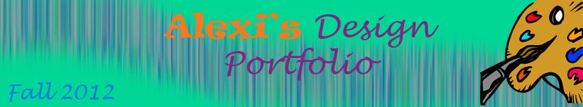


Calendar
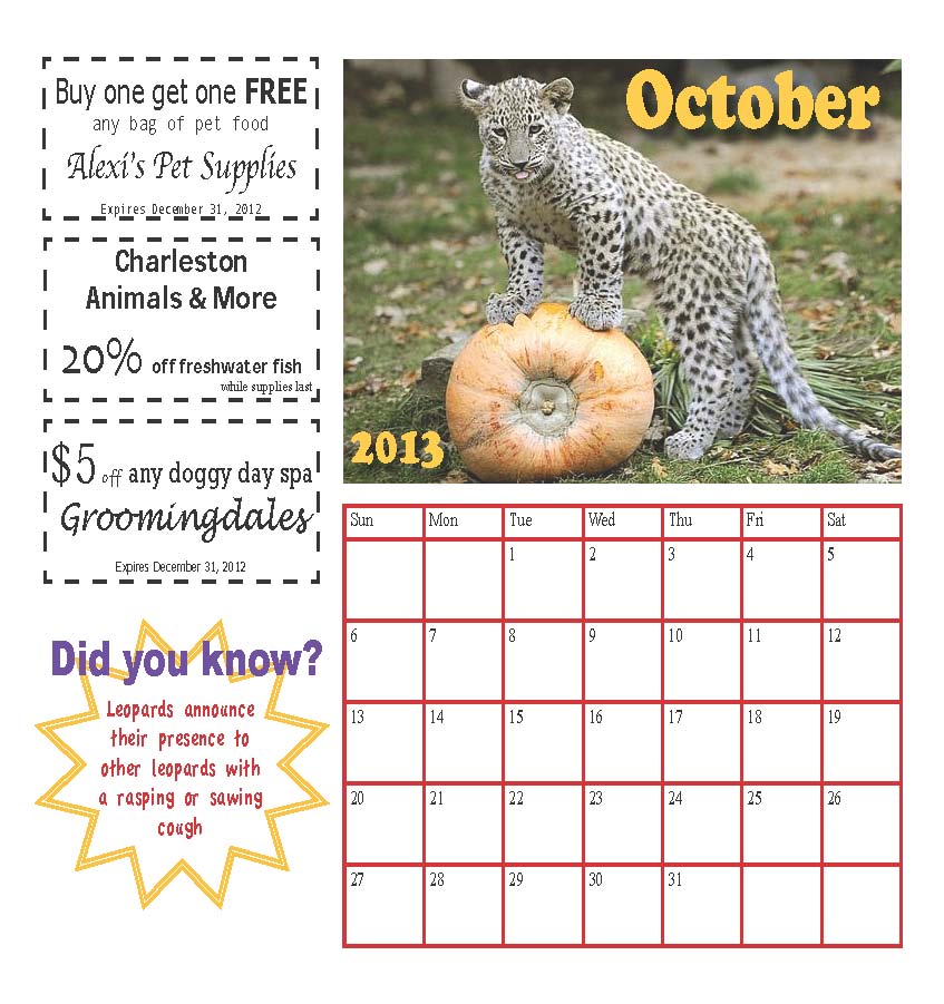
For my calendar, I decided to align the actual calendar and the main picture on the right of the page and then I had the coupons aligning the left side of the page so that if coupons were needed the person could I easily cut them out without ruining the calendar. I like to have the fun fact at the bottom left corner so that it doesn’t take away too much from the calendar, but I made it in a bright calendar that would stand out so nobody would forget to read it. I aligned the month and year on the right and left sides of the picture to separate them but at the same time keep them close together. You can’t tell because they are in black and white, but the color of everything on the calendar (whether it’s the border of the calendar, the fun fact shape, or the month/year) is the same as one of the colors in the picture. I used the eyedropper tool to produce those colors.
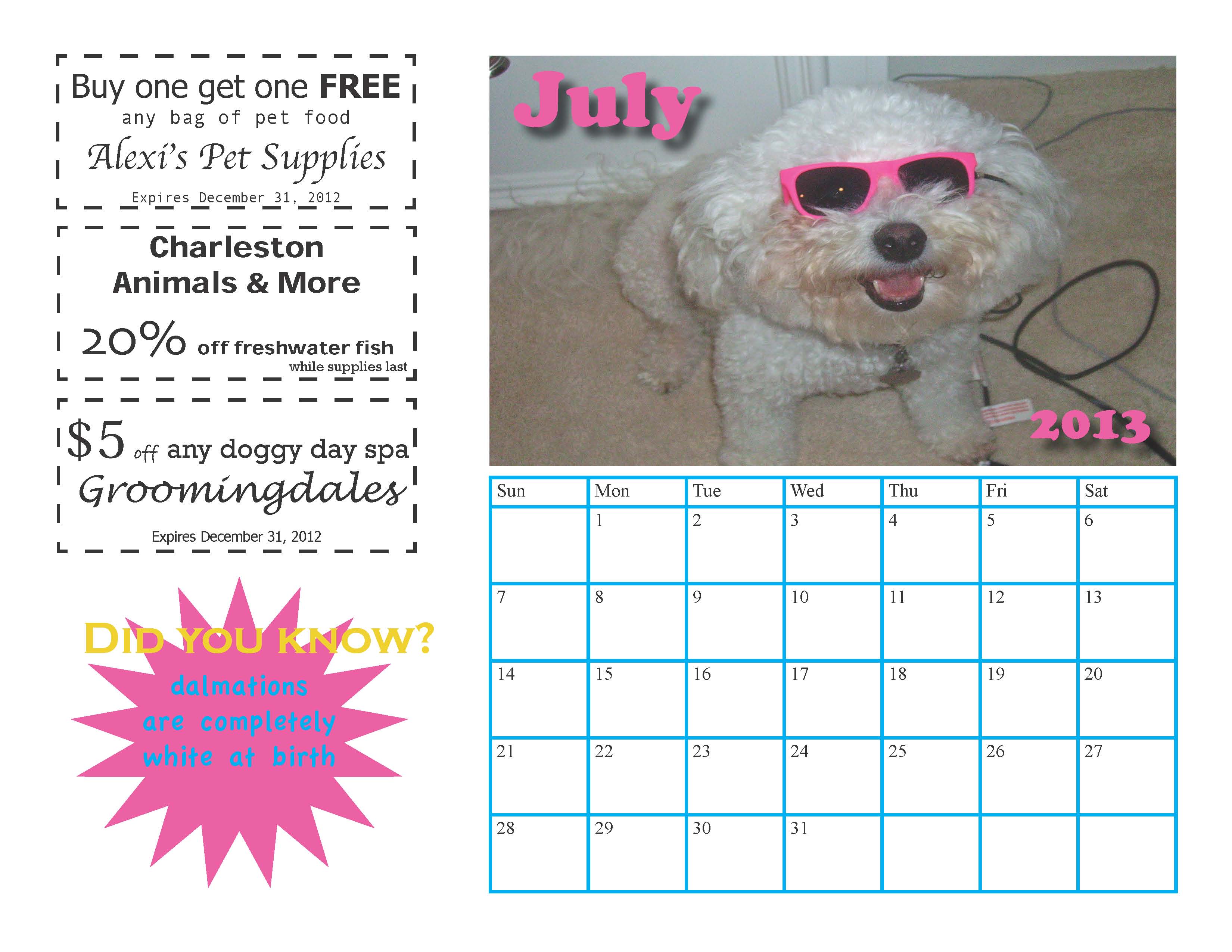
In the coupons, I tried to make them look like real coupons that I have used before. I made the size of specific words like “free” or “20%” larger than other words to catch the readers’ attentions. I also made the expiration date very tiny because that’s what most coupons do so that the reader will read what the coupon is for before they see if it is still good or not. I center aligned most of the coupons because I, personally, thought it looked better.
The month and year on two of the three calendars have drop shadow on them so that they don’t look like they are attached to the picture. Instead, they look like they are jumping out of the picture in a cool 3-dimensional effect. On the December calendar I did not do this because the words were not a part of the picture so they were easy to read, regardless.
I incorporated fun facts that had to do with the animals on the picture. So, for the October calendar with a picture of a leopard, I included a leopard fact. For the July calendar with a picture of a dog, I included a dog fact, etc.
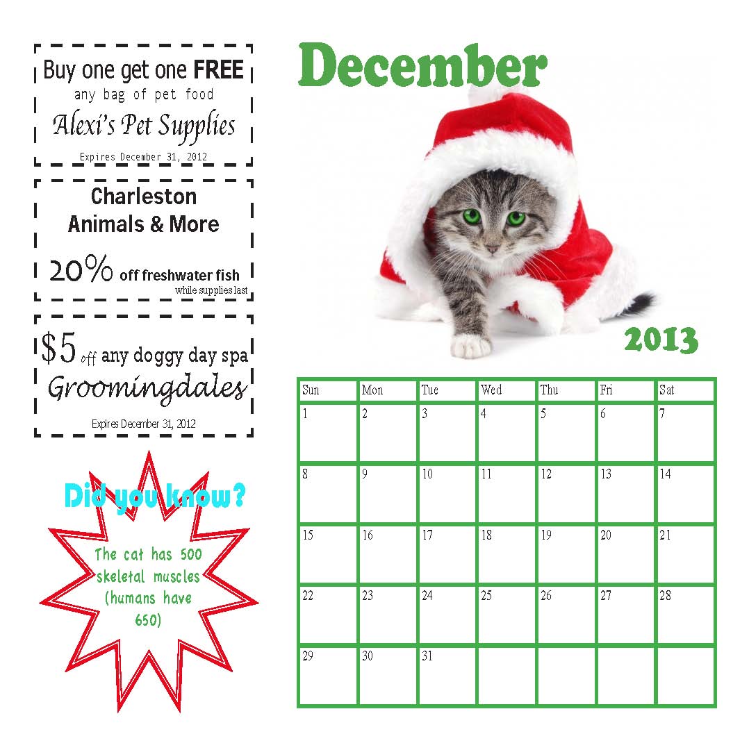
I used repetition all over my calendar. The fun facts are all placed in the same place and all say “Did you know?” but I changed them up by making them different colors and different shaped polygons. Also, with the month and year on each calendar, I may have put the month on the left and the year on the right or vice versa. This way I created repetition, but also made it appear differently.
My design appeals to animal lovers because I would assume that most animal lovers own pets whether it’s a dog, cat, fish, or even a parrot. Animal lovers will love the pictures of different animals each month along with the fun facts. Most importantly, the coupons will be so helpful, and having them hang up next to a calendar will help the reader to not forget to use them. Overall, my calendar is easily readable and not too crowded at all! I think the readers of my calendar will enjoy the various pictures, fun facts, and the helpful coupons. The colors of everything on the page make it easily readable too because it’s not a million different colors everywhere. Instead, the colors come from the picture so it all matches.