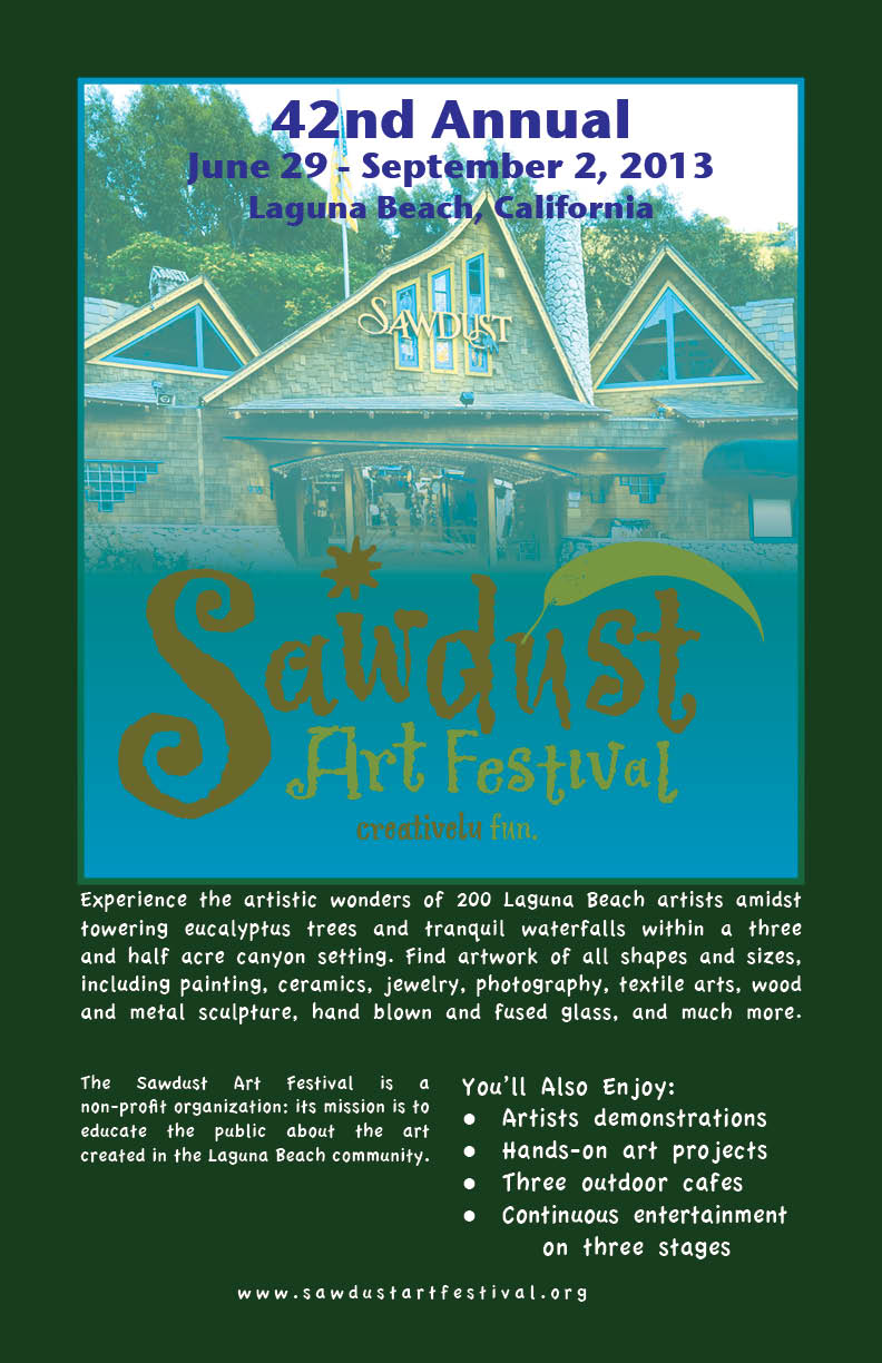
Magazine Ad

I wanted to do the Sawdust Festival entrance as my main background image. I think it’s the main symbol of the festival, and it gives the readers a preview of what they will see at the festival. I made the gradient swatch of the picture blue and green because it blended really well with the picture. I made the “42nd Annual” and the date and place in blue to be different from the rest of the page, but I also wanted it to blend in and not stand out too much. I kept all the words at the bottom pretty simple so that all different fonts and symbols would not distract the reader. I also put what I thought was most important in bigger fonts. My design will appeal to the audience because it just comes out and says what it is. There’s no confusion or trying to find out what the ad is describing. I used the opposite gradient swatch on the border of the picture because I think it gives a cool touch. I placed the logo of the Sawdust Art Festival on top of my entire picture at the bottom so that if the reader were to just quickly glance at the ad, they would be able to see what it was for.


